 Timecard
 Pastely

KPI dashboards, compared. Checked November 2026.
Spikely vs Databox
Shared KPI dashboards for a team, against a quiet alert app for a founder.


- Price
- $9.99 a month or $79.99 a year
- Analyst $71 a month, Team Core $199 a month, billed yearly
- Runs on
- iPhone, iPad, Mac and Apple Watch
- Web, iOS, Android and TV
The short answer
Databox builds KPI dashboards and scorecards for teams, with alerts on thresholds or percentage changes, on web and phone. Spikely is an Apple app for founders that alerts when a number leaves its usual range and lists what your tools recorded. Choose Databox for shared reporting, and Spikely for quiet alerts.
 Written by Prince Ajuzie, who builds Spikely, so weigh it accordingly.
Checked against Databox's own pages on .
Choose Databox if
- You need dashboards a team or clients can share.
- You report on marketing and sales tools too.
- You want an Android app or a dashboard on a TV.

Choose Spikely if
- You don't want to build dashboards at all.
- You want Mac, Lock Screen and Apple Watch views.
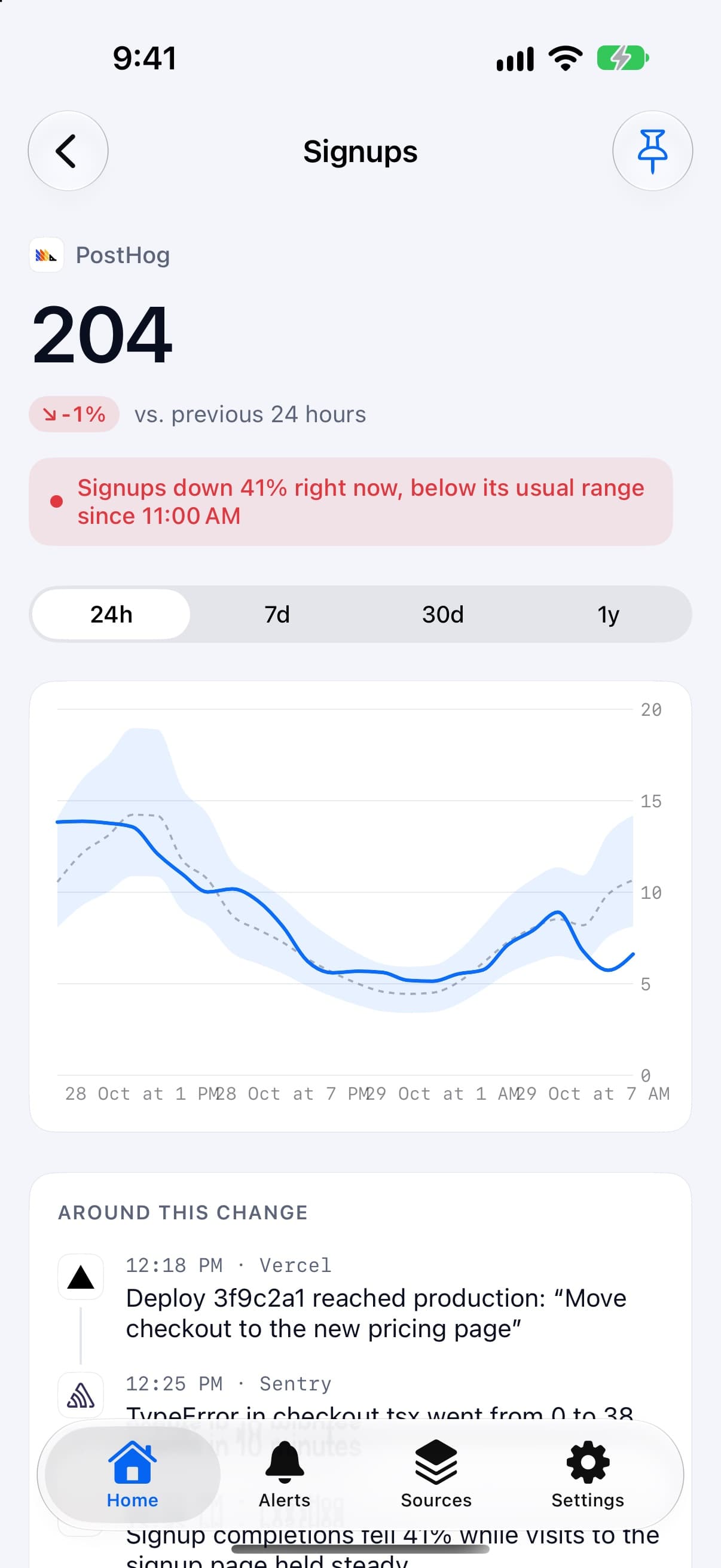
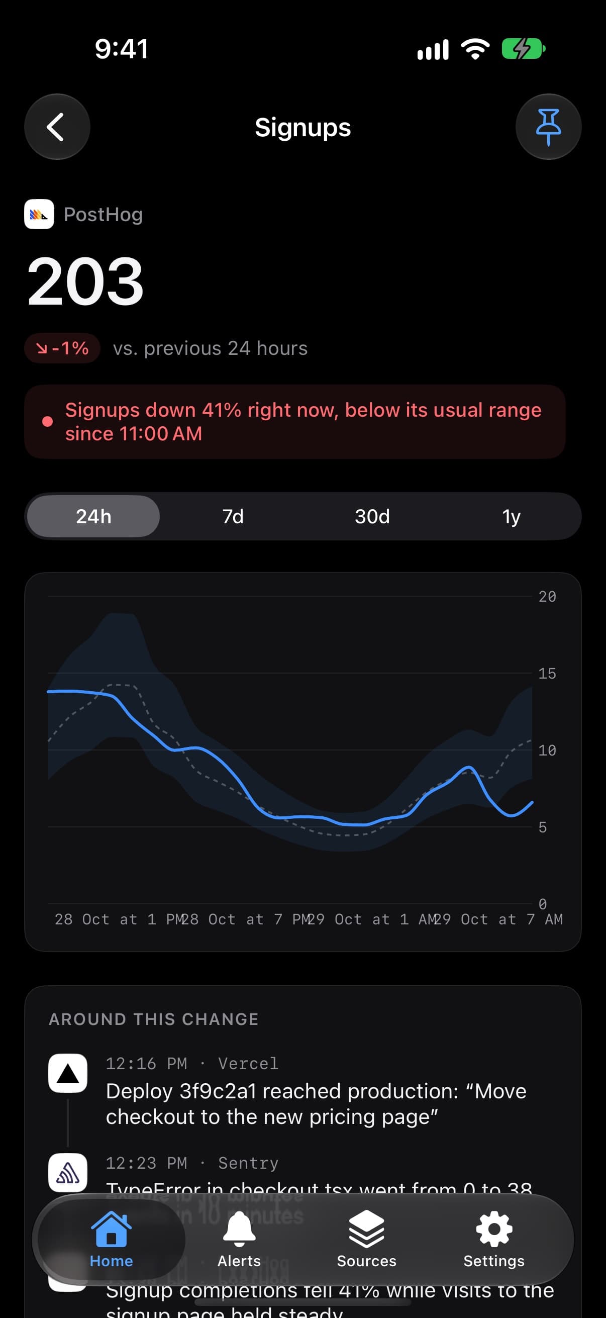
- You want the alert to arrive with the deploy and error beside it.
Feature by feature. Side by side.
| Spikely | Databox | |
|---|---|---|
| What it's for | SpikelyTelling you when a startup number breaks its usual pattern | DataboxBuilding and sharing KPI dashboards and reports |
| Price | Spikely$9.99 a month or $79.99 a year | DataboxAnalyst $71 a month, Team Core $199 a month, billed yearly |
| Free option | SpikelyPartly: 3-day trial on the yearly plan | DataboxYes: Free plan with 3 data sources and daily sync |
| How it decides to alert you | SpikelyYes: A usual range for each metric by hour and day, plus your own rules | DataboxYes: Thresholds and percentage changes; anomaly detection listed on all plans |
| Reaches your phone | SpikelyYes: Alerts on iPhone, iPad, Mac and Apple Watch | DataboxPartly: Yes, on iOS and Android; alerts listed from Team Core |
| What it reads | SpikelyYes: 19 tools across payments, hosting, analytics, app stores and errors | DataboxYes: 3 to 30 data sources by plan, marketing and sales included |
| Shows what else changed | SpikelyYes: Yes, lists what your other tools recorded around the move | DataboxNot listed |
| Widgets | SpikelyYes: Home Screen, Lock Screen, Mac desktop and menu bar, Apple Watch | DataboxNot listed |
| Runs on | SpikelyiPhone, iPad, Mac and Apple Watch | DataboxWeb, iOS, Android and TV |
| Team features | SpikelyNo: No, built for a founder's own devices | DataboxYes: Yes, including agency plans |
"Not listed" means we didn't find it on the pages we read, not that it doesn't exist. Prices and features change. Sources: Databox pricing, Databox mobile, Databox scorecards help.

What really sets them apart
Build or connect
Databox is a toolkit for making dashboards. Spikely has no dashboard builder: you connect a source and each metric gets a usual range.
Team reporting or one person
Databox has team, client and agency plans. Spikely has no team features.
Sync speed by plan
Databox lists daily sync on Free and hourly on paid plans, with a 15-minute add-on. Check how quickly you need to hear about a move before you choose a plan.
Can you use both?
You can, though they overlap more than most tools on this list. Databox suits the weekly team view, and Spikely suits your own devices.
Questions, answered plainly.
Its pricing page lists anomaly detection on its plans, and alerts from the Team Core plan upward. The page's notes on the Free plan are inconsistent, so confirm before relying on it.
It lists a free plan with three data sources and daily sync. Paid plans started at $71 a month billed yearly when we checked.
When you're one person on Apple devices and want to be told about unusual moves without setting up dashboards or thresholds first.

Try it on your own numbers. Then decide.
Connect a source with a read-only key and see what Spikely flags. You can look around before you sign in.
3 days free on yearly · iPhone, iPad, Mac and Apple Watch
Compare Spikely with
Stripe's app runs your account. Spikely watches for moves that break pattern.
Deep subscription analytics on the web, against pattern alerts on your phone.
Free subscription reporting for small startups, against alerts across your stack.
Alerts on your PostHog insights, against alerts across PostHog and 18 other tools.
Infrastructure monitoring for engineers, against business numbers for founders.
On-call routing for teams, against pattern detection for one founder.
A free-to-start metrics dashboard for iPhone, against an alert-first app.
Free-to-start metric widgets for iPhone, against an alert-first app.
An API for pushing your own events to iPhone, against an app that watches your tools for you.